
Dark mode isn’t just a gimmick — it can help save the planet.
The history of dark-themed design
Since the early days of computing, the use of ‘dark mode’ in digital interfaces has been a thing.
And while digital interfaces have been white and bright for a while, dark-themed designs are having a moment again.
To understand the changing fortunes of low-key palettes in digital design, we need to look at changing screen technologies and their relationship with energy consumption.
The dark ages: CRT displays
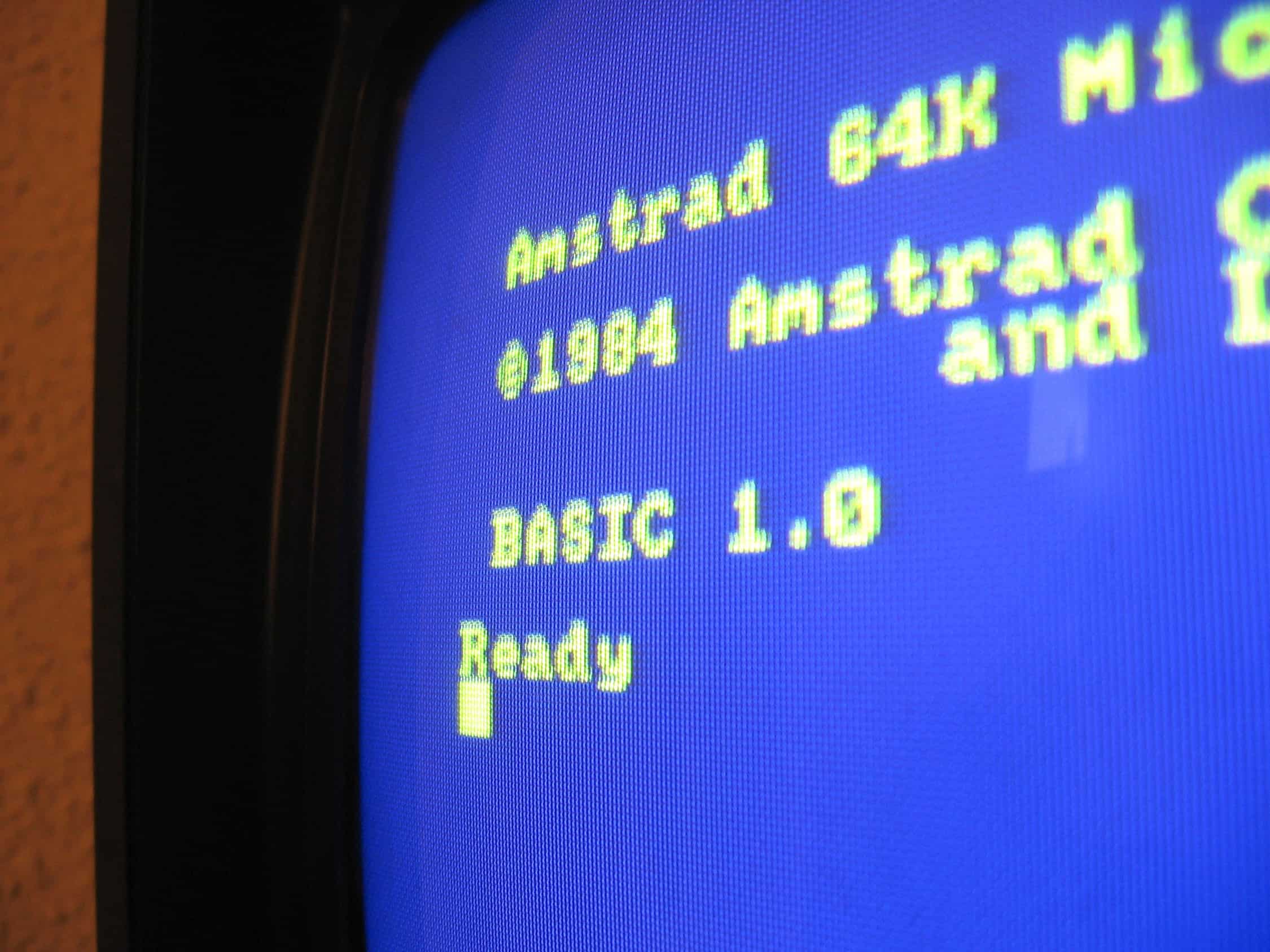
‘Dark mode’ pioneers: Amstrad CPC user interface, 1984
[Credit: Manuel Bartual from Madrid, España, CC BY-SA 2.0, via Wikimedia Commons]
Those old CRT displays used a lot of energy to display lighter colours (and emitted a fair amount of heat in the process). CRT monitors work by illuminating separate red, green and blue pixels to create different colours. Displaying white requires all three colours to be illuminated at the same time.
To avoid excessive energy use (and heat production), early digital interface designers embraced ‘dark design’. Interfaces used black or blue backgrounds overlaid with pale text.
Let there be light: the rise of the LED display
As more energy efficient light-emitting diode (LED) screens grew in popularity, the colours of digital interfaces changed too.
Because LED screens use a single backlight to illuminate the entire screen no matter what colour they’re displaying (including black), the idea of saving energy by opting for a darker colour palette became irrelevant.
No longer held back by energy efficiency concerns, digital interface designers moved towards an aesthetic of clean, white backgrounds.
Back to black: OLED screens
In recent times, organic light-emitting diode (OLED) displays have begun to replace LED screens.
With this new technology, energy efficiency considerations around colour, once again, come into play.
The reason? OLED screens work in a similar way to CRT displays in that they create colours by illuminating individual pixels and switching off pixels to create black.
While OLED displays are currently not the dominant screen type (as of 2022, around 44% of new mobile devices sold have OLED displays) it is a technology that is becoming increasingly prevalent.
The cost of a pixel colour: how much energy can we save?

So, how much energy can we save by making more considered colour choices?
In 2018, Google shared their research on OLED screens and the relationship between colour and power consumption (see chart, above).
By displaying a solid colour, Google’s research team was able to determine that a completely white screen uses around six times the energy of an entirely black screen on OLED devices. Meanwhile, blue is twice as energy hungry as red and green.
But there’s one big problem in trying to pin an exact number on the energy savings available by using different colours.
It’s fairly intuitive that white, displayed on a screen at 100% brightness, uses much more energy than black. But what happens if a screen is set to, say, 50% brightness? Then the energy savings between the two colours narrow (because the dimmer screen is effectively displaying grey, rather than pure white).
Very few people use their screen at 100% brightness. Indeed, many of us have screens that vary their illumination based on lighting conditions.
In spite of the difficulty of pinning an exact number on the energy savings available from darker colour palettes, many forward-thinking organisations are pushing ahead and making it part of their commitment to sustainability.
What does a low-energy colour palette look like?
As you might have guessed, low-energy colour palettes often embrace darker, muted tones, reserving white and lighter colours for small accent areas.
If you’re worried a dark design will make your website look dull, think again.
Far from being drab, black can be a sophisticated colour associated with power and style. Meanwhile, muted colours can help communicate brand values around sustainability.
The St Patrick’s Festival website (below) is an excellent example. The designers have used a low-key colour palette that is rich and sumptuous.
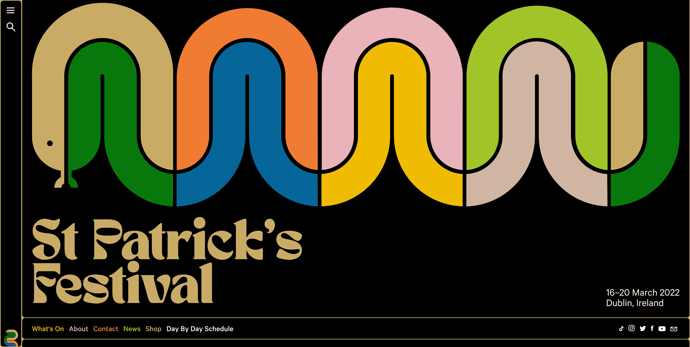
A dark-themed low-carbon colour palette: St Patrick’s Festival 2022 website
But it’s fair to say that such colour choices won’t work for every brand. Your colour palette still needs to communicate the right messages to your target audience.
The good news is that committing to a low-energy colour palette doesn’t mean a black background is your only choice.
First, consider the range of low-key colours that aren’t black — for example, the dark grey we’ve chosen for this website. The truth is there’s a whole world of colours available to you at the darker end of the spectrum — from olive green to midnight blue to burnt orange.
Although black may be the ultimate energy-saving colour, simply making the decision to avoid using pure white for your backgrounds (unless absolutely necessary) will make a difference — and the more traffic your site has, the bigger the energy-saving impact.
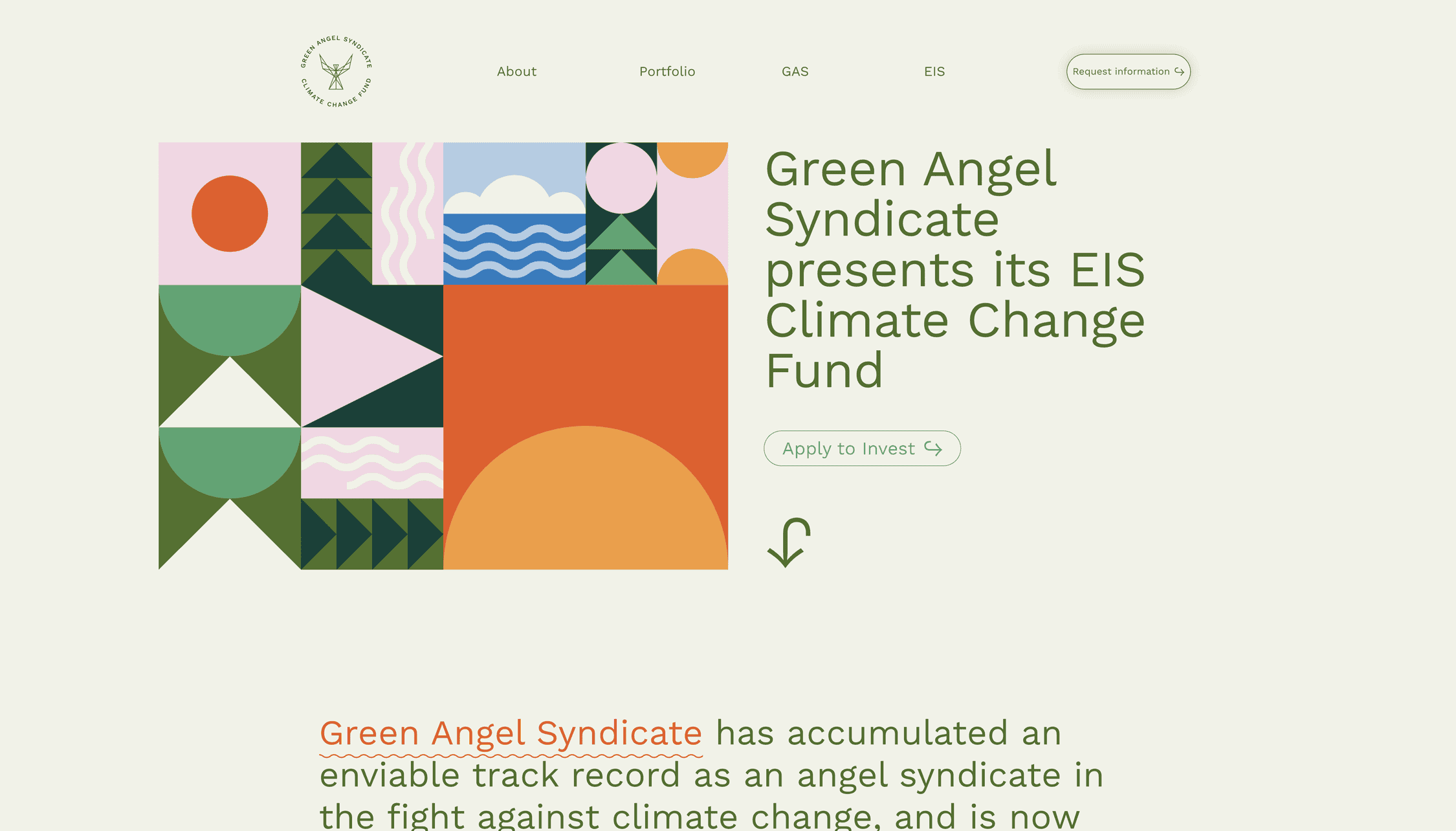
Energy-saving colour palettes don’t have to be black: Climate Change Fund website
Climate Change Fund (above) is an example of a website that’s using a light background while avoiding pure white. The use of a muted green also helps communicate their brand values — and it just so happens that green is the most energy efficient colour (after black), too.
How dark web design benefits your audience
Not only are darker colour palettes better for the planet, there’s a straightforward benefit for your users too (for those that use OLED devices, anyway): darker designs drain less battery.
Because dark-themed designs use less energy, anyone using an OLED device to access your website or app will get a little more life out of each battery charge. Multiply that across the thousands of charge cycles of a device’s lifespan and it starts to add up.
Dark mode and accessibility: a curse or blessing?
While darker designs have their benefits for energy efficiency, a good digital designer will always balance this with the needs of the end user.
In a study, user experience research experts Nielson Norman Group, found that dark mode impairs readability for people with normal vision.
On the other hand, the same study cites research published in Nature Research’s Scientific Reports in 2018 suggesting that long-term exposure to ‘light mode’ may be associated with shortsightedness.
Yet another consideration is that in people with impaired vision — for example, those with cataracts — dark mode has been found to enhance their ability to consume on-screen content.
A delicate balancing act
Choosing the right colours is just one element to consider when designing a sustainable website or digital product.
As ever, the benefits of energy efficiency need to be carefully balanced with your brand’s messaging and user experience.
The main thing to remember is that embracing a low-carbon colour palette doesn’t mean a black background is your only option.
Even small adjustments — such as using alternatives to pure-white backgrounds where possible — when added together across the growing numbers of OLED devices will make a real difference.
In a world where we’re increasingly mindful of the need to use resources efficiently, responsible businesses should be doing everything they can to be part of change for the better.
Contact us to find out how we can help you create a more sustainable website that follows the principles of low-energy colour palettes.