UI Design

View Live Site
Challenge
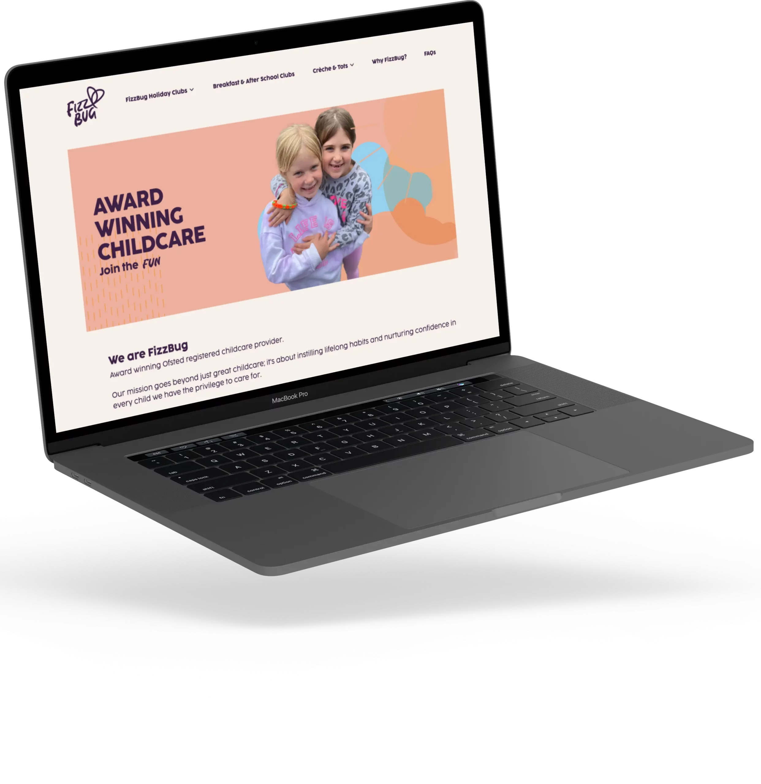
FizzBug’s energetic innovative and caring approach to childcare is inspiring. Not just to the growing number of children they look after every day but to anyone who comes into contact with their team. It’s no surprise that FizzBug had grown to offer more activities across more sites than ever before. But it meant they’d also outgrown their website. The old website used the Wix cms, it didn’t provide the quality of user experience for parents looking to book or discover what was on offer. Nor did it convey the very essence of FizzBug, the Fizz that makes them so special.

INNOVATIVE CHILDCARE
Solution
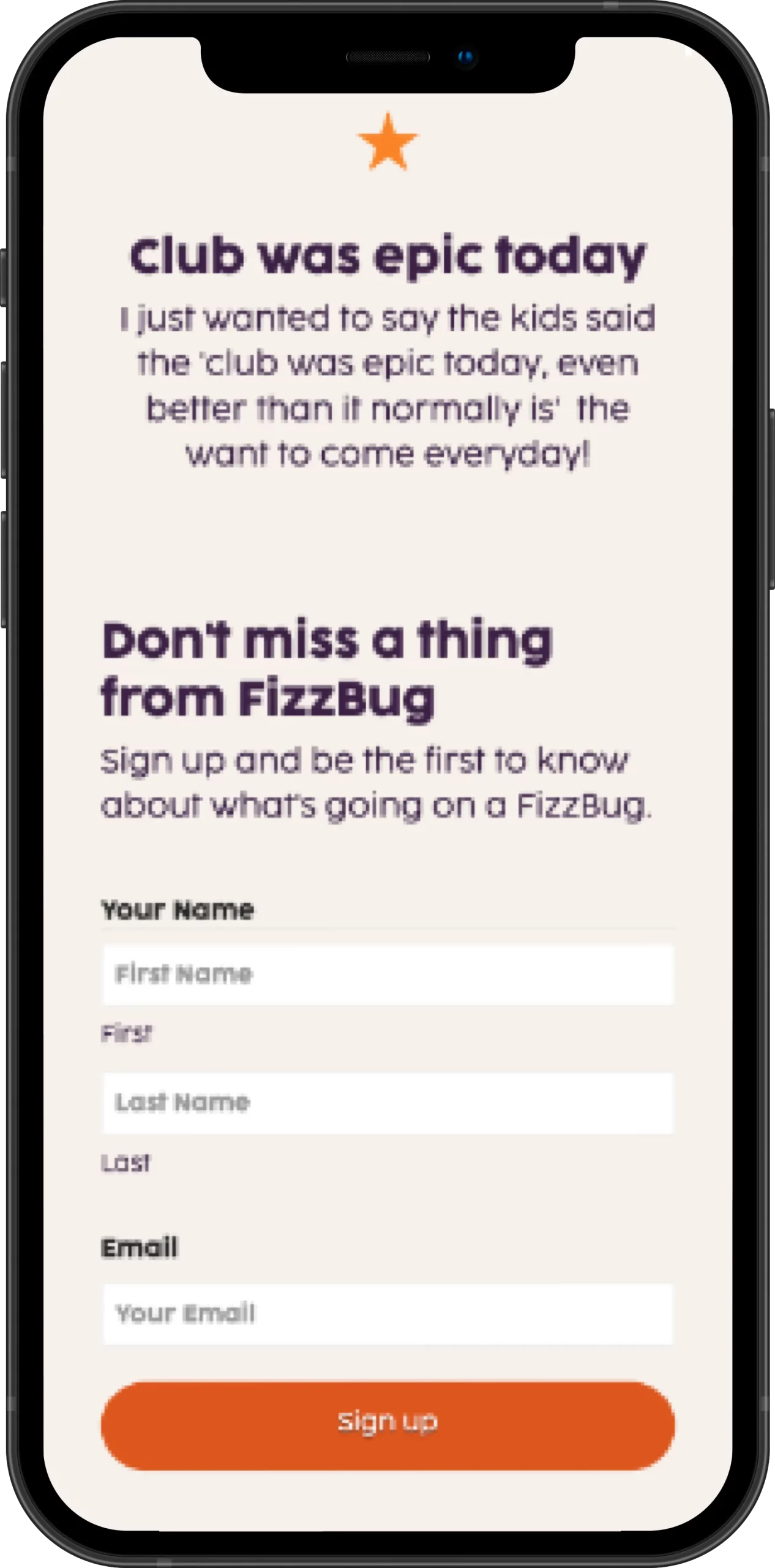
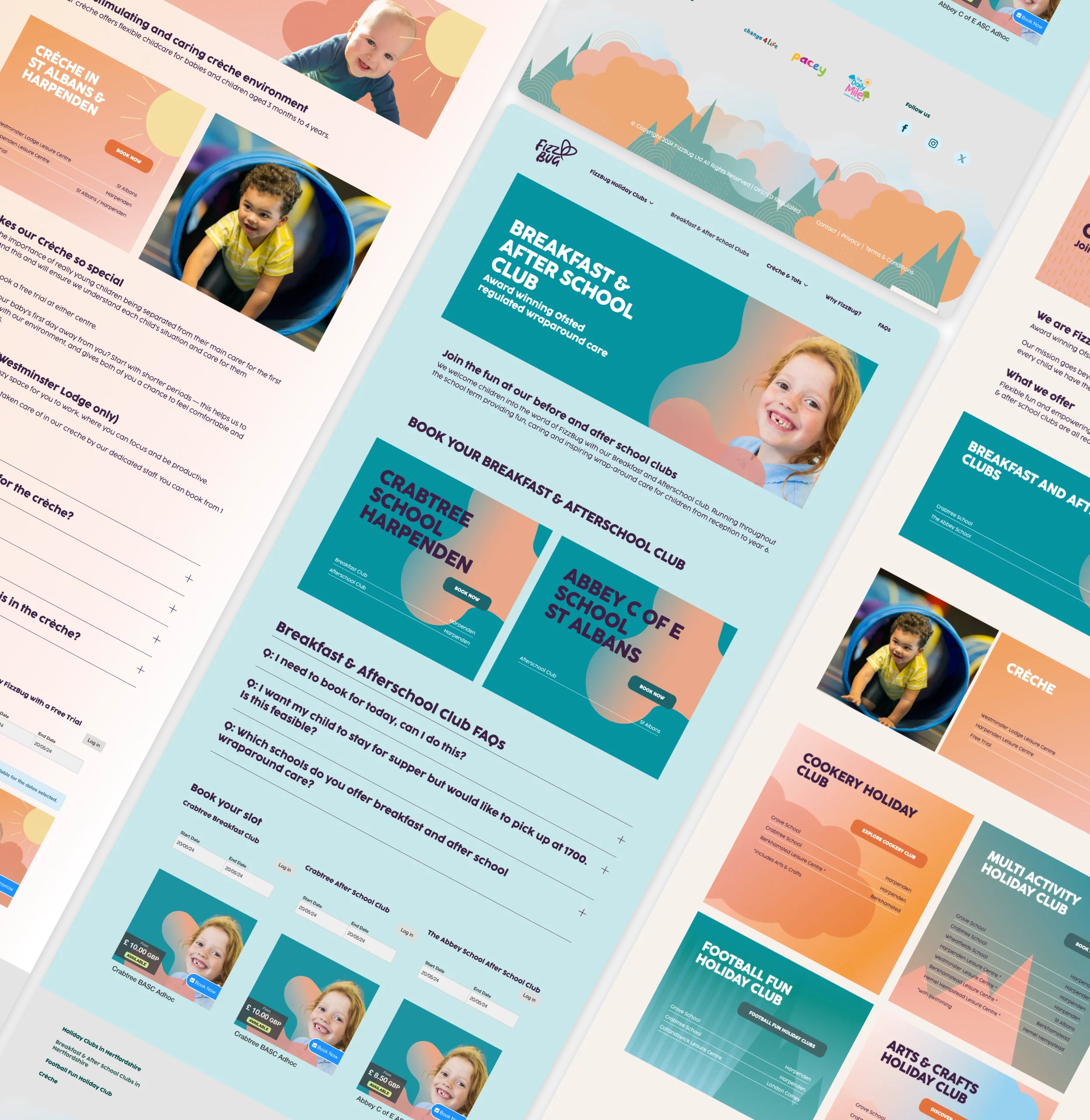
A complete rethink was on the cards. Our entire process centred around providing a web experience that reflects the care & energy that define FizzBug. With careful analysis of user flow we created a new site information architecture. This new navigation structure combined with consistent web elements means the FizzBug site is easy to use and ready to keep growing as they do. If you want the technical detail, we built the new website on the WordPress CMS with integrations to their existing CheckFront CRM.
Impact
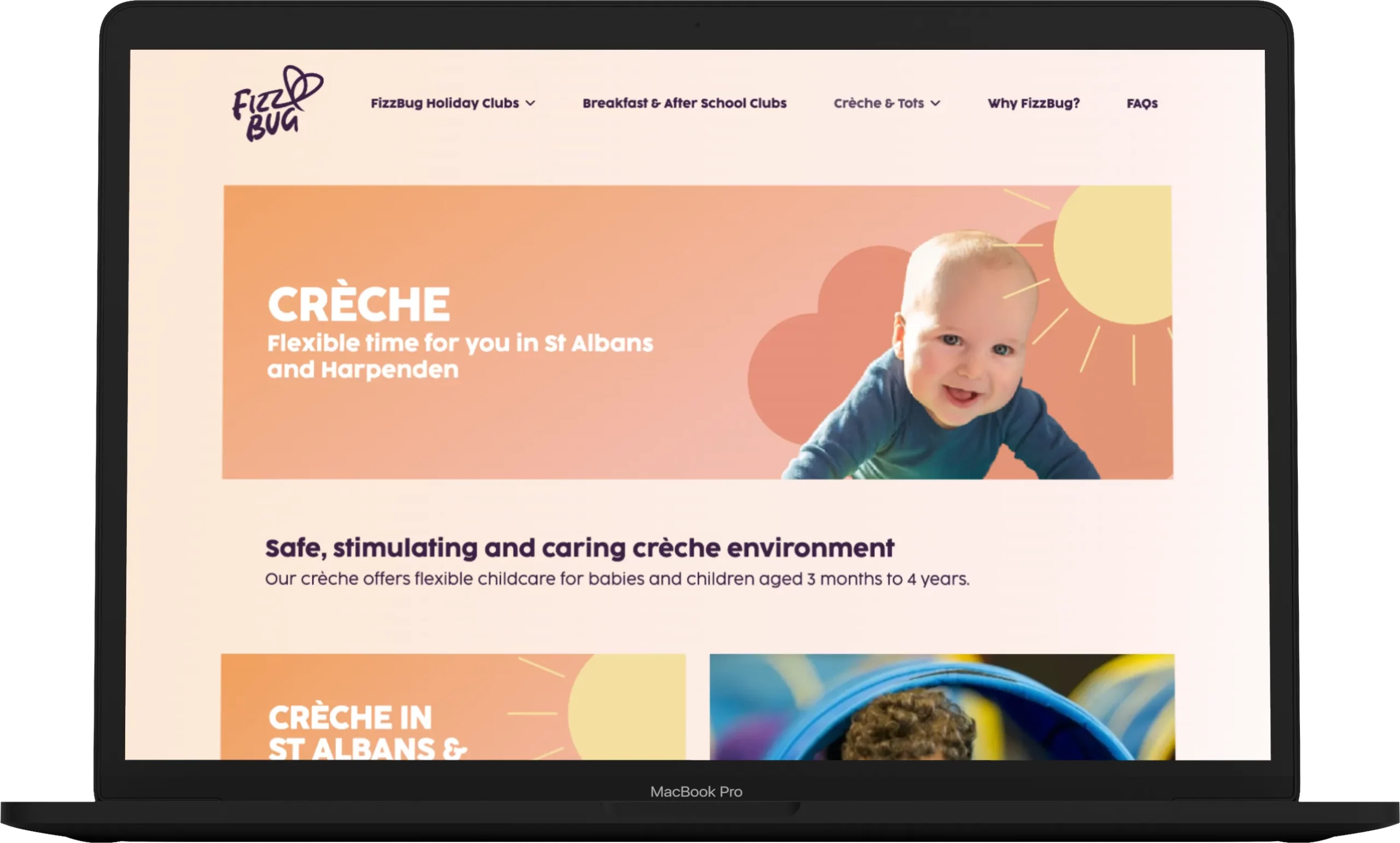
The new website is still in its infancy and we’re certain the impact will grow and grow. Already the site has drawn positive comments from customers and opened the door for some new opportunities for FizzBug to expand. The new site is faster, more accessible and better for the planet. Every metric is a significant improvement from the outgoing website.

Results
We test every website we build and we're proud to achieve superb metrics across a range of tests. Your new website from Consider Digital is built to perform.
Performance
97
Accessibility
96
Best practices
100
SEO
92
CO2 impact
An efficient page load is a valuable metric for reducing the digital carbon footprint of the project along with a number of other benefits in usability.
0.33g